OUTCOME
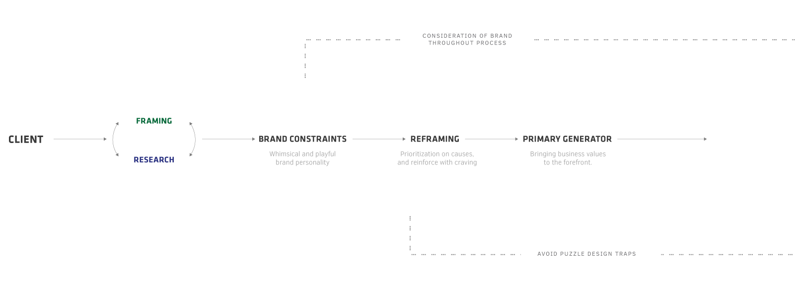
Ever since the company started in 1978, Ben & Jerry’s has always believed in linked prosperity, aiming to benefit everyone that’s connected to their business. To achieve the company’s corporate goal, Ben and Jerry’s operates on a three-part mission: product, social and economic. Focusing on the social mission, Ben & Jerry’s is always very vocal of their social beliefs. There are several products, and campaigns regarding to different causes they care about. And Our aim is to bring this social aspect to the forefront by redesigning part of their website.
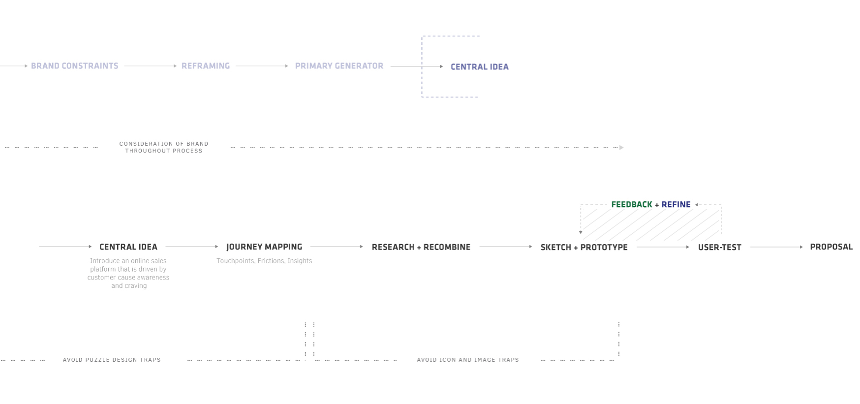
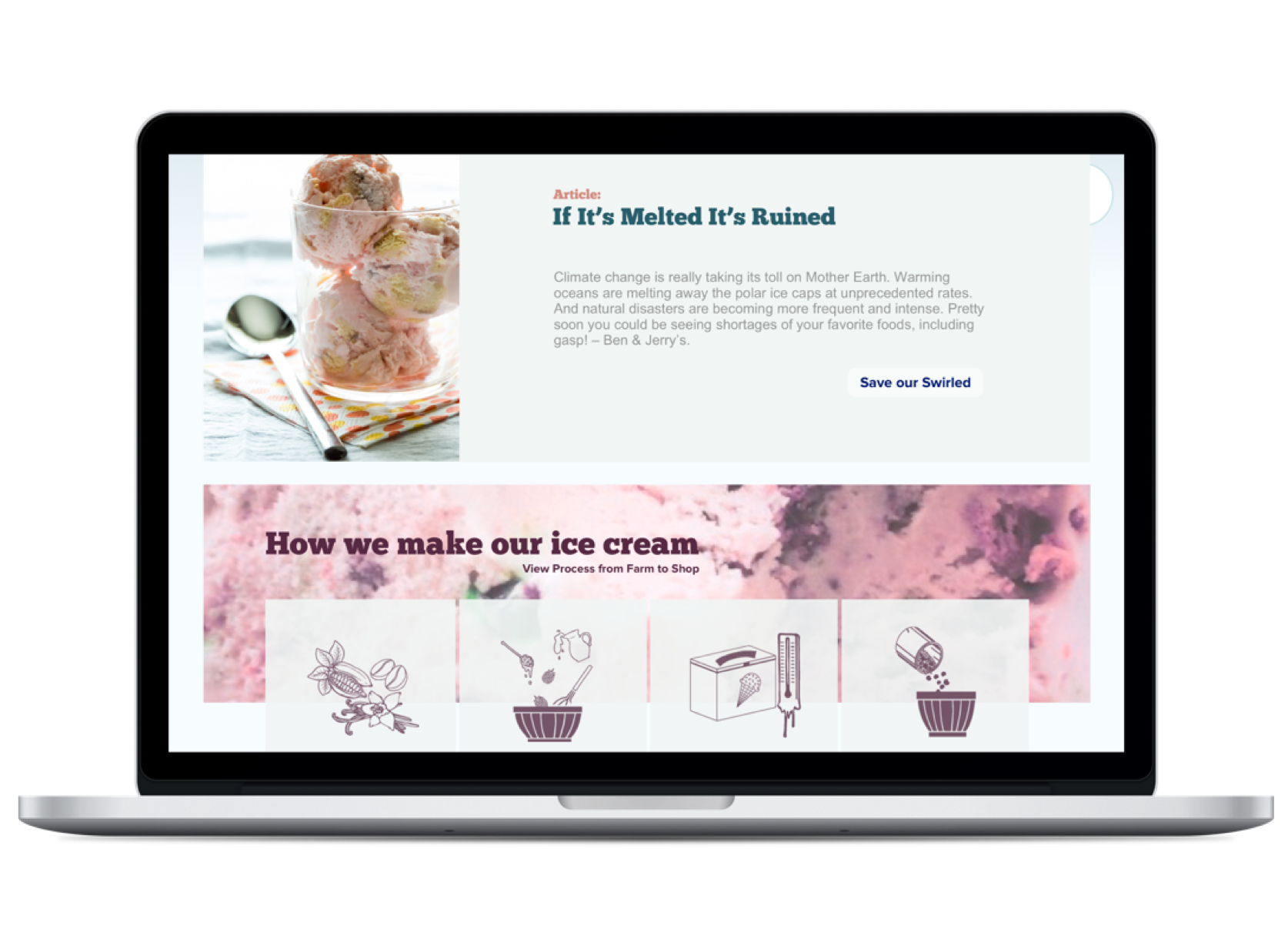
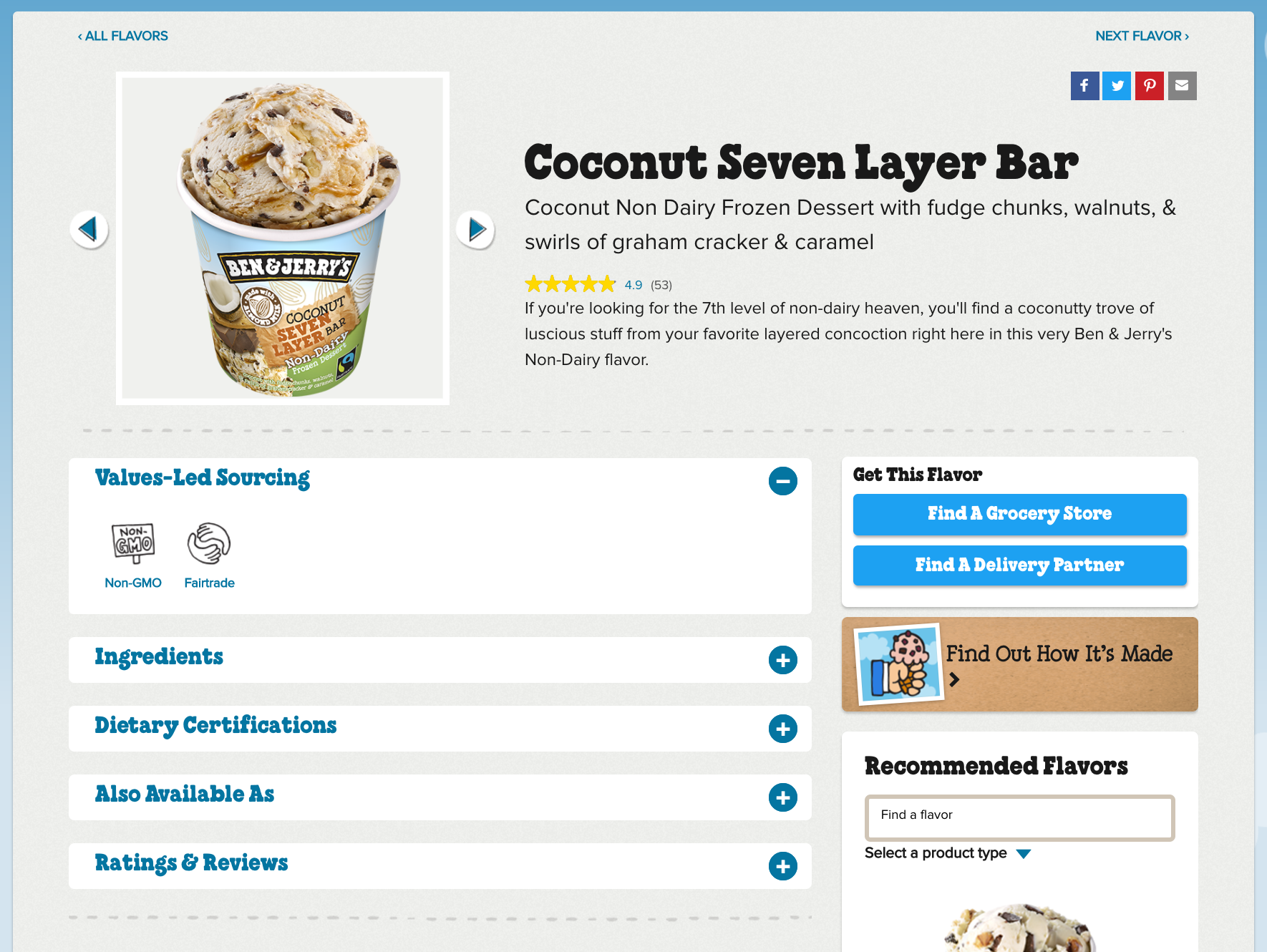
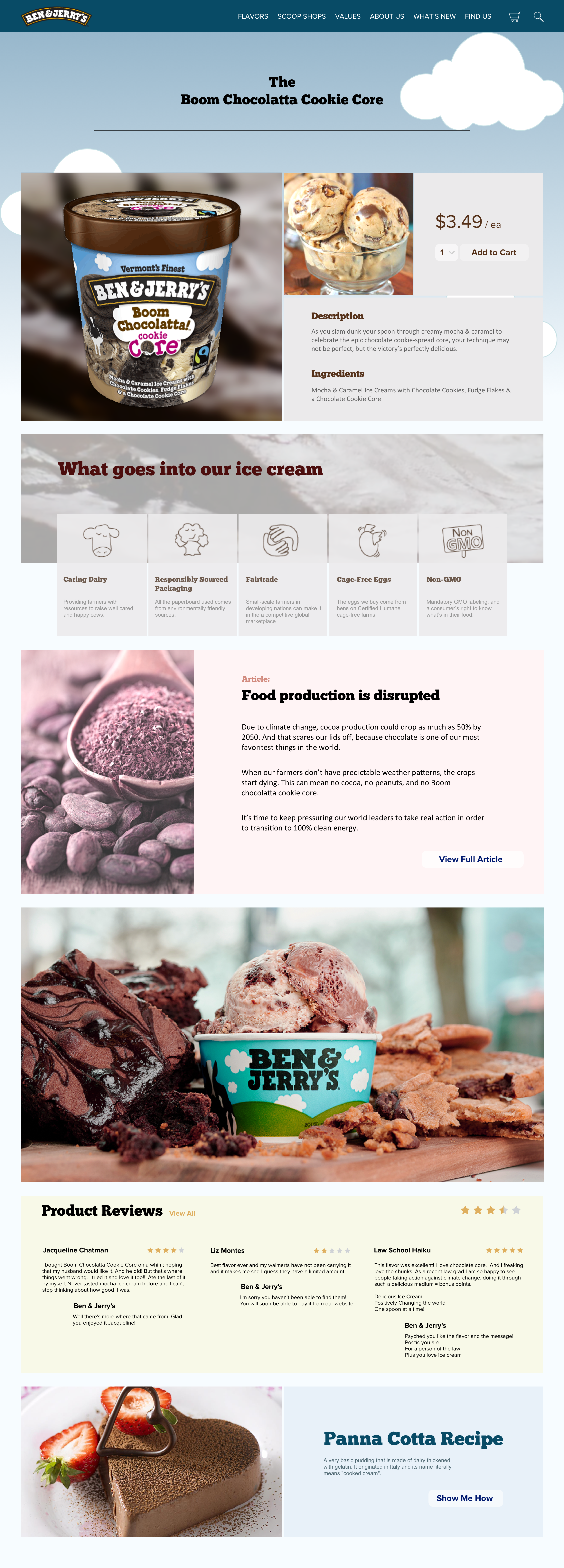
We are introducing interactive articles as a form of aspirational reinforcement to engage customers with causes that are related to their respected products. We created a flow for the visitors to get through the content easily, quickly and without distractions by improving the user interface and the website layout. We also rearranged the content, added calls-to-actions early to build interest and curiosity for visitors to explore other parts of the website. Also, we integrated pre-purchase and post-purchase support that begins from introducing products to customers… to product details… to recommendations and alternative options...purchasing, thank you and confirmation.
ABOUT PROJECT
Team:
Nika Lohrasbi Azar
Derek Tam
Jimmy Hsu
Aaron Chen
Afreen Jetha
Duration:
3 Weeks
My Role:
Jump to Style Guide and Screenshots
Interface Design
Content Strategy
Information Architecture
INITIAL BRIEF

Find a business opportunity within the assigned company (Ben and Jerry's) and find an intervention which will provide value for the business and consumers in the future.
CORE VALUES
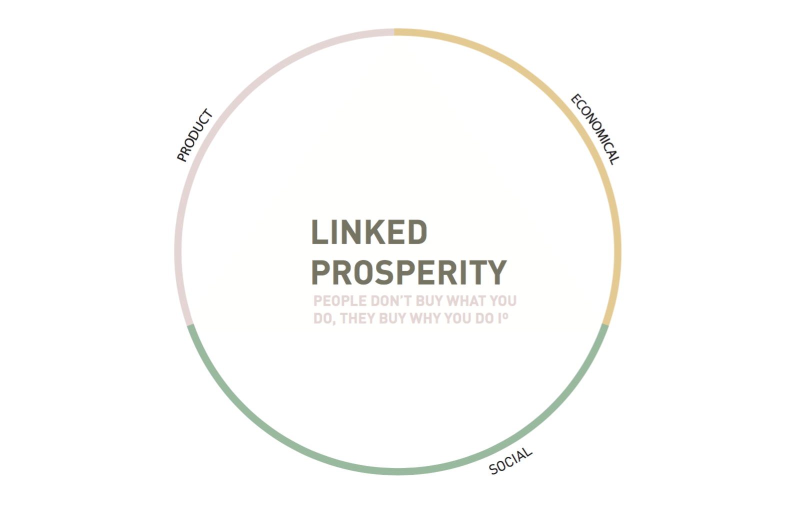
Linked prosperity
Definition: Simple but radical idea that everyone and everything the company touches should benefit from its profits.
Values: Ben & Jerry's operates on a three-part mission that aims to creates. linked prosperity for everyone that's connected to our business: suppliers, employees, farmers, franchisees, customers, and neighbors alike.
3 Part mission
- Social activism (social causes they care about, Ben’s passion)
- Economy (the company making profit and sales growth)
- Product (the ice cream itself)
INITIAL PROPOSAL
Idea:
Reflection:
BUSINESS OPPORTUNITY
CONTEXT
WHY WEB
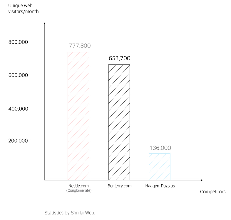
Ben & Jerry’s website already receives high amounts of traffic directed from social media and search.
653,000 unique visits each month. (October, 2016)
Average duration of stay: 2:34
Pages per visit: 2.53
BUSINESS STRATEGY
FINAL PROPOSAL
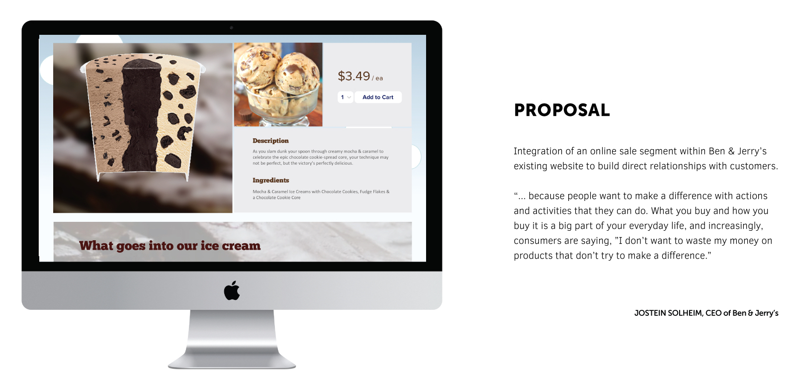
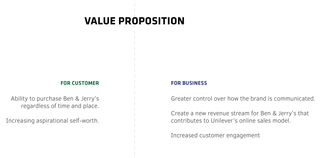
We found out that Ben & Jerry's is facing a growing threat from Amazon.com due to their weaker online presense. In order to secure more revenue, Unilever initiated the Business-to-consumer business model which is to have its own brands to start a direct online sales to their customers. This way, Unilever not only could secure more revenue, but at the same time, its brands could “build longer term relationships and ensure more loyal customers.” And we realize this can be our opportunity to intervene from Ben & Jerry’s perspective.
JOURNEY MAPPING
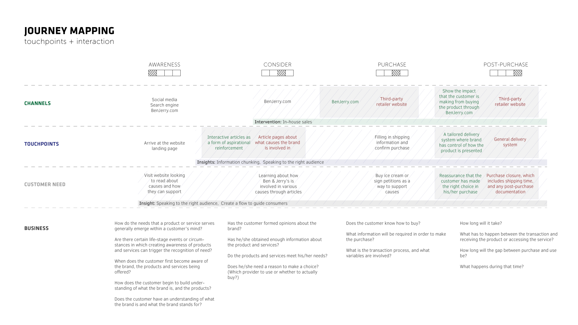
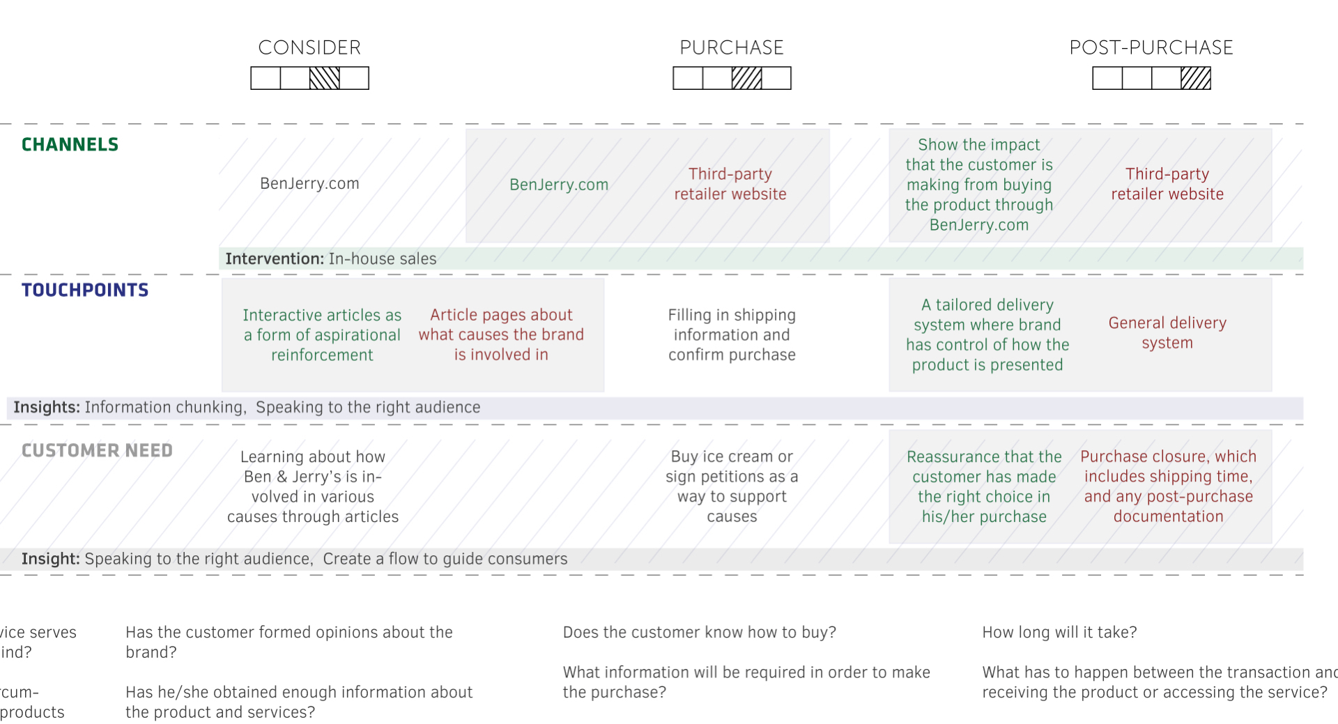
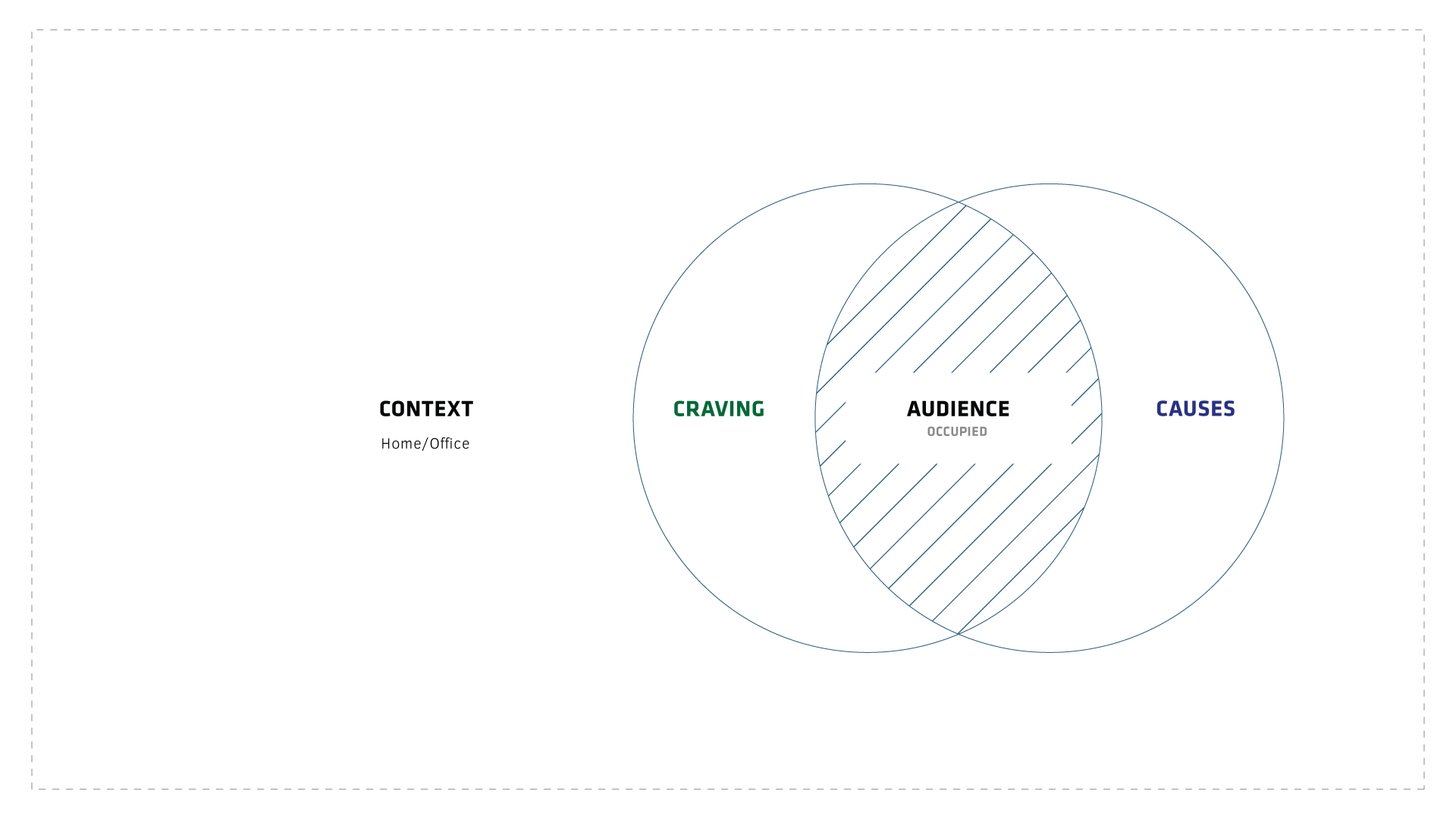
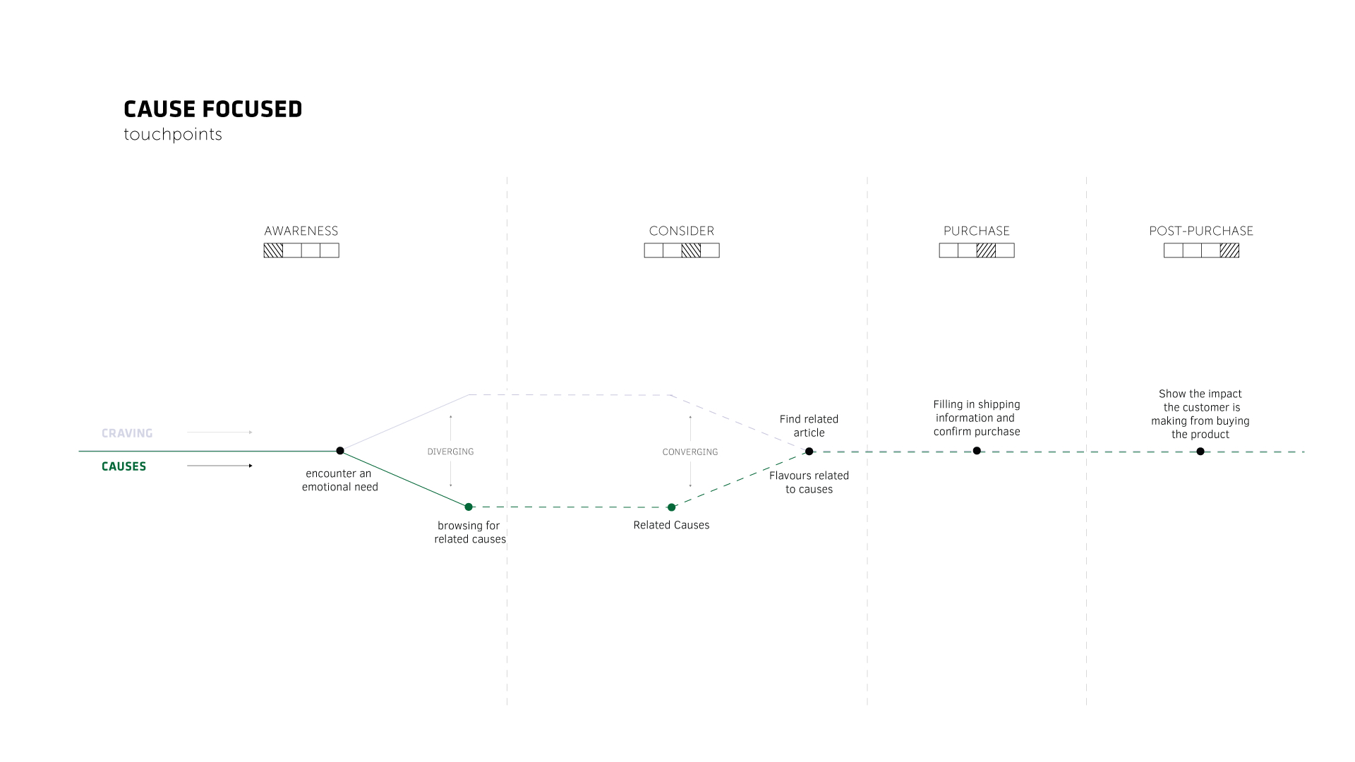
We used a journey framework to identify how Ben & Jerry’s product uses these two emotional needs to engage with customers.
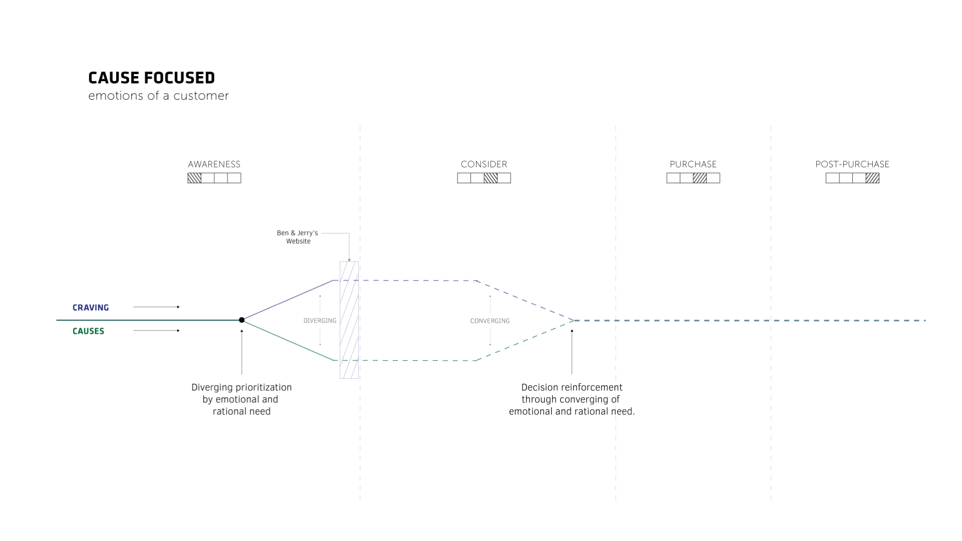
Here we show a customer with both attributes to start with. However, as time progresses, customer will first encounter one of the emotional need.
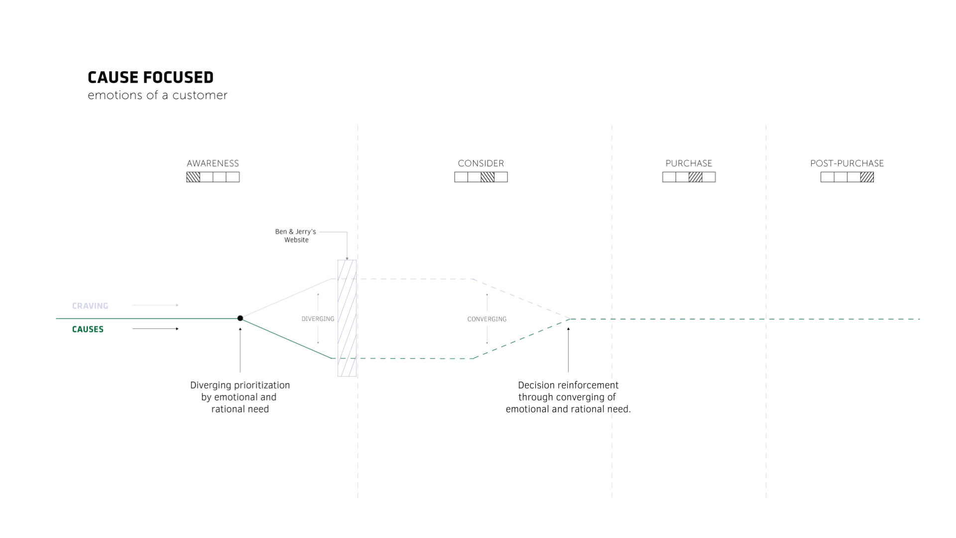
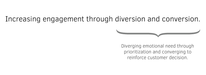
They might suddenly want ice cream, or they might see a post on Twitter and develop empathy. We’re not saying that one is more important than the other from the customer’s perspective, but there is a priority depending on which emotional need they encounter first. What happens afterwards, is that when customers reach to certain point within the consideration where the primary drive, which the first encountered need is not enough for the users to proceed to the next stage, the purchasing. And this where the second emotional need comes into place as a secondary drive to help customers engage into the purchasing stage. So, we want to make sure we incorporate this same type of experience within our redesign. And that leads to our
TOUCHPOINTS
LANDING PAGE
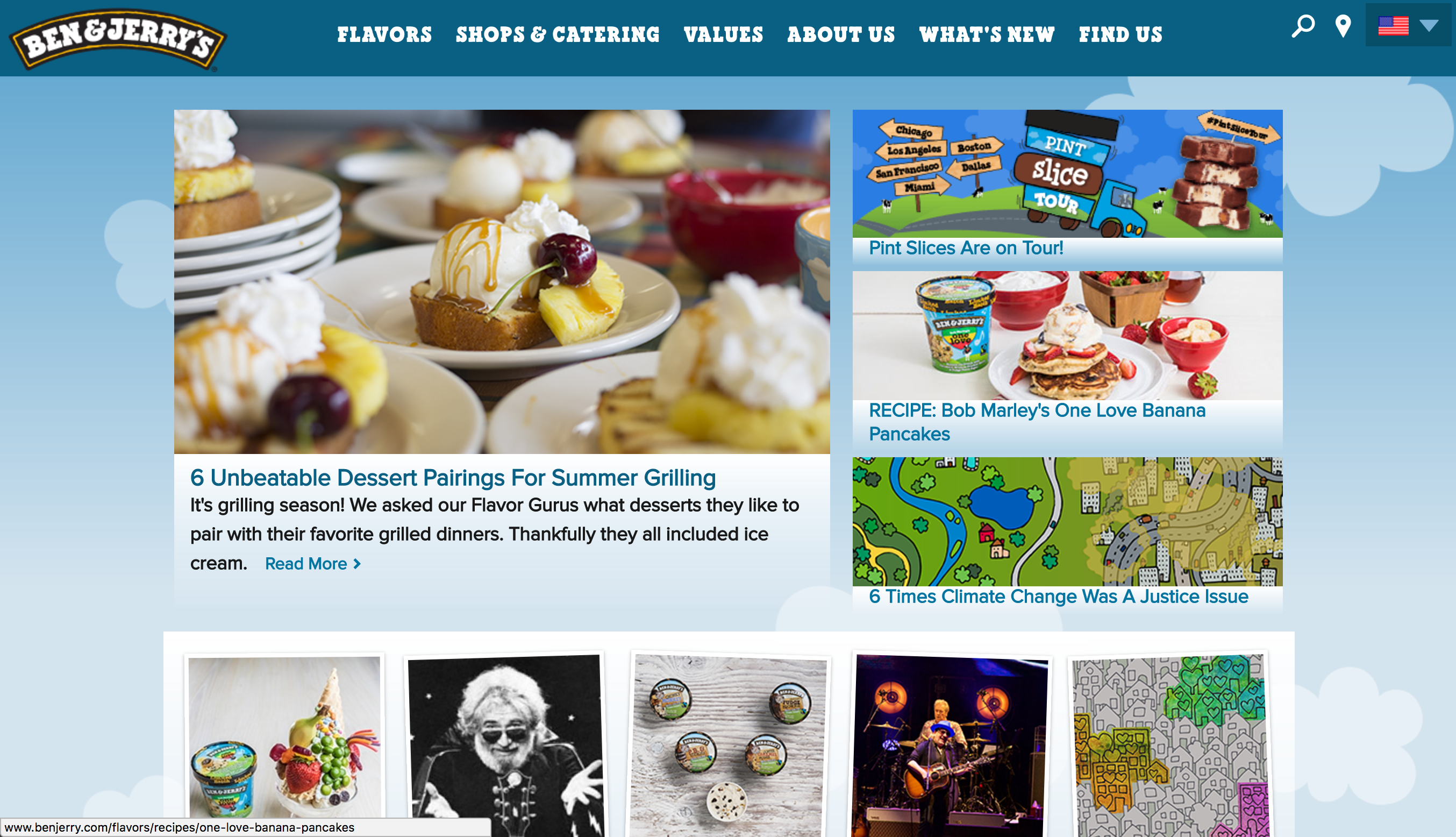
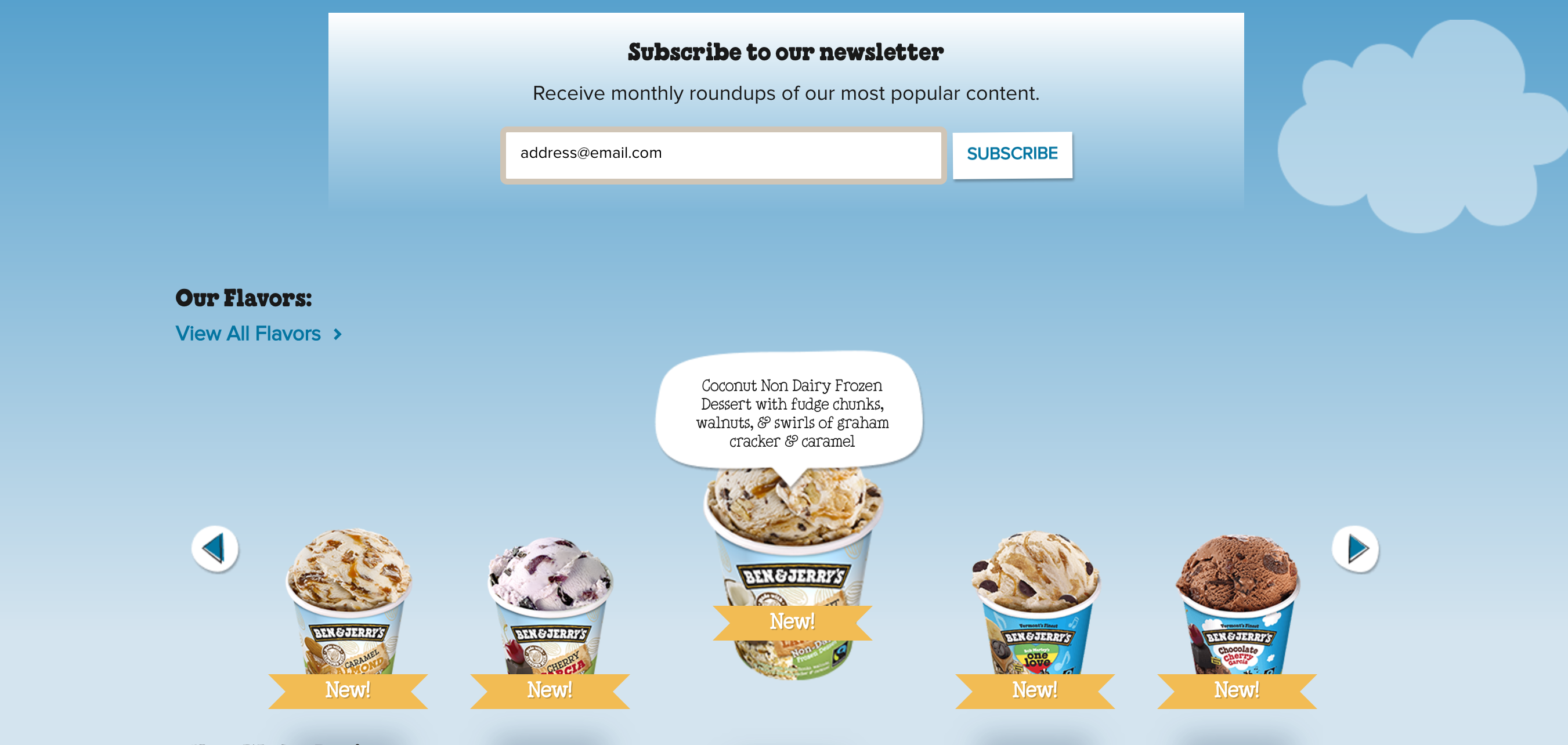
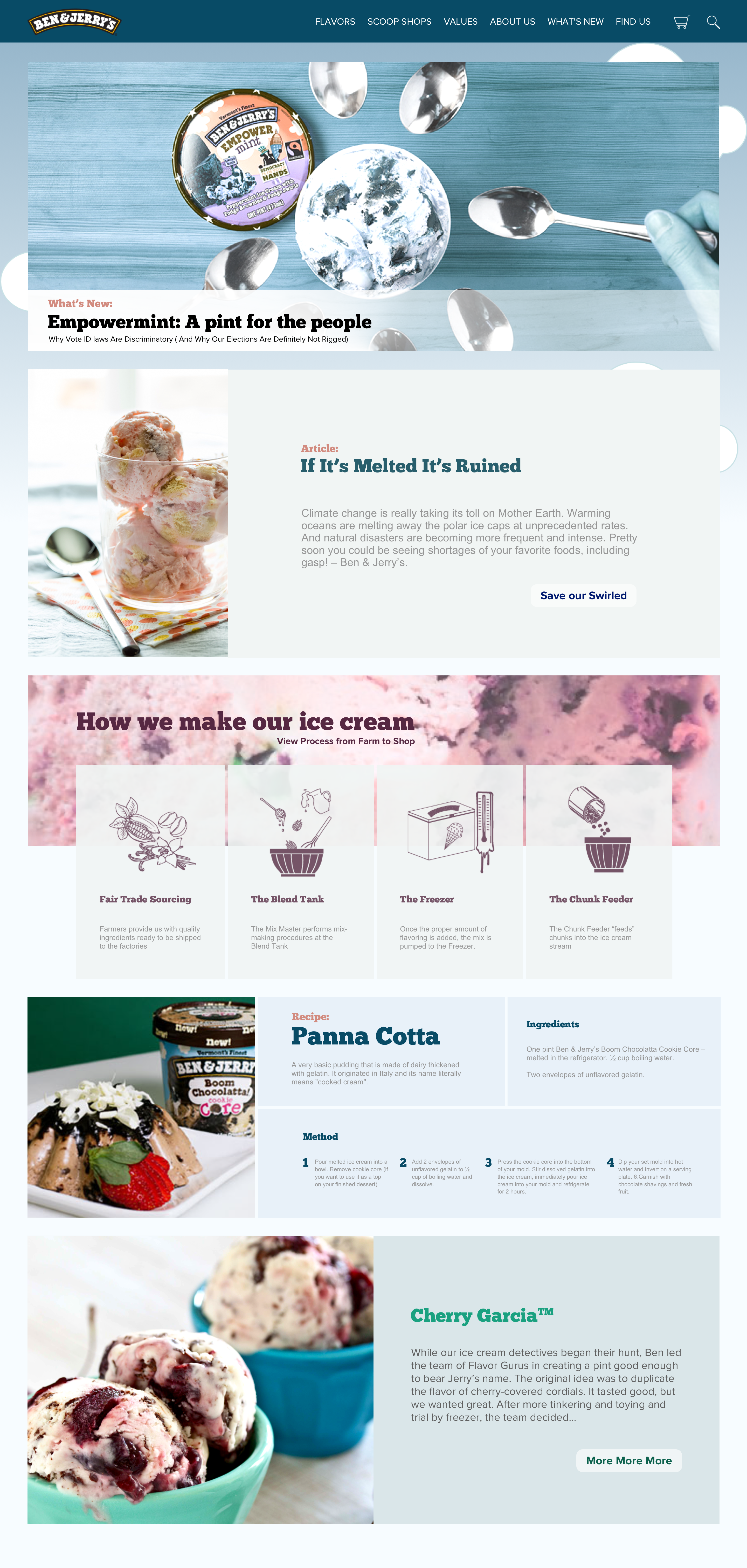
On the landing page, we want to highligh the multiple key points that show the values of Ben & Jerry's: starting with the current articles, the process of how ice cream is made and other products. We achieved this by organizing the information displayed by adding white space and capturing the audicC
Our Proposal
ARTICLE PAGE
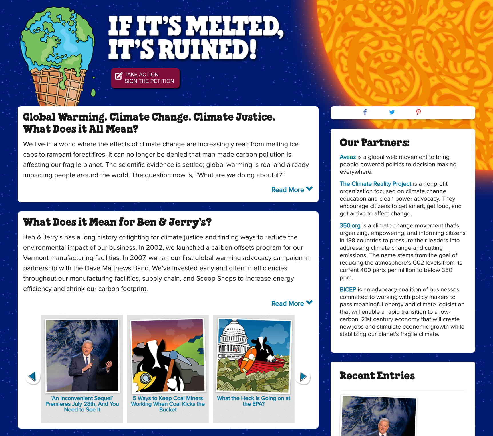
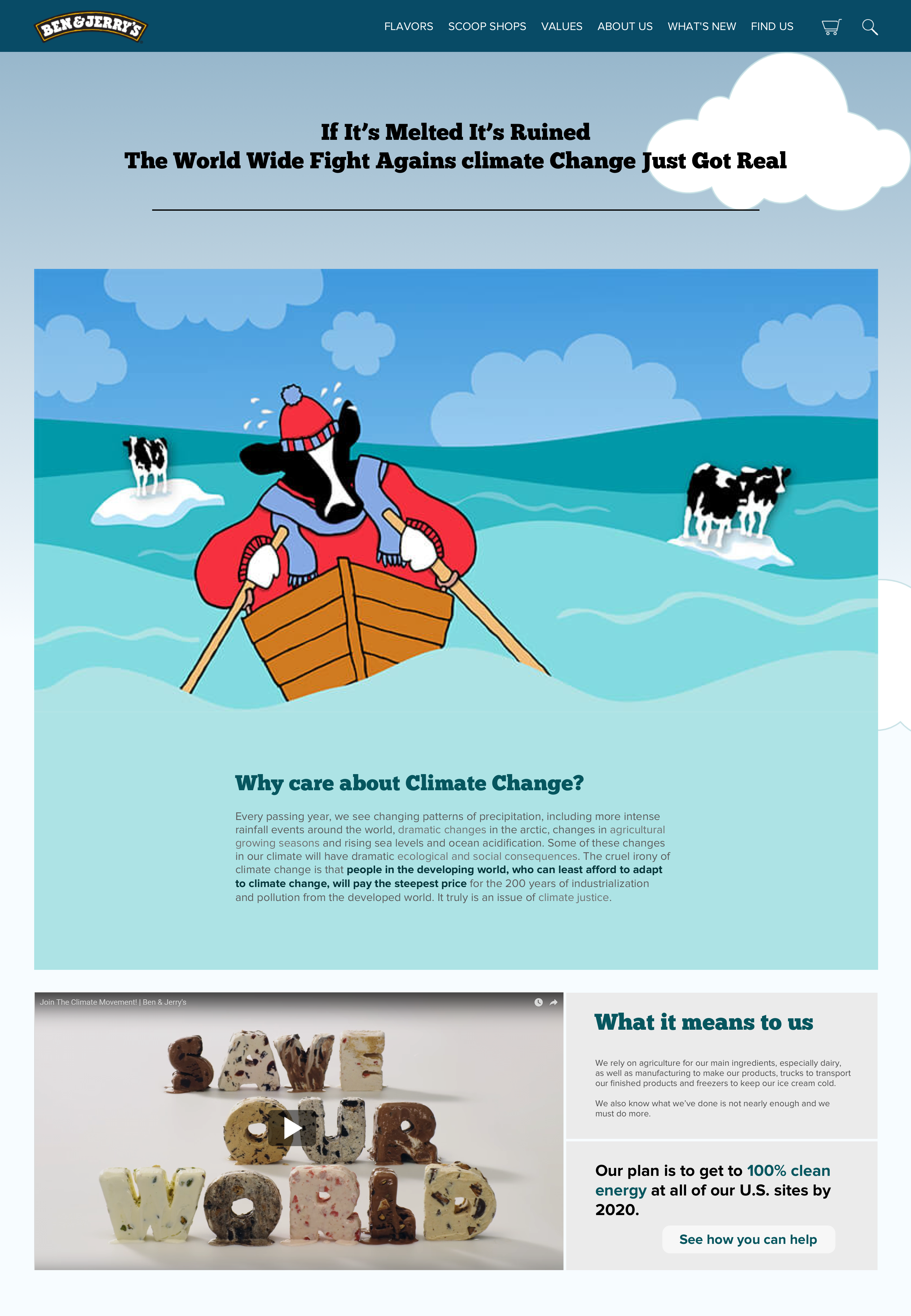
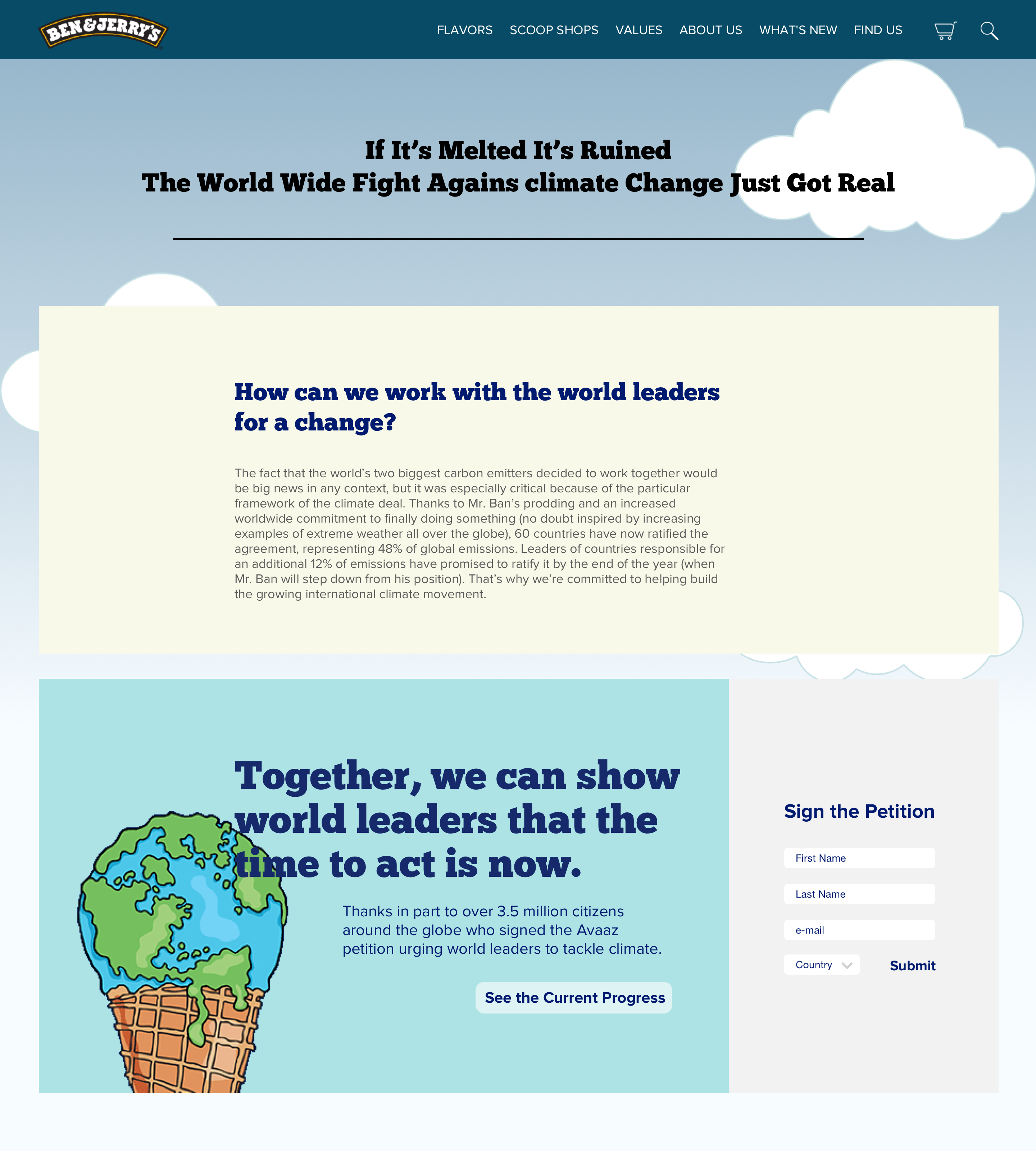
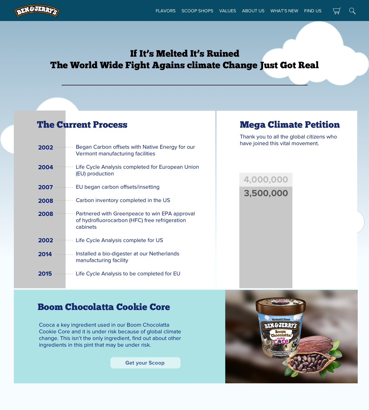
Gradually engaging the customer and progressively disclosing the how, why and what of the cause, we were able to condense the information into digestible information for the user. Since the user is signing the article, they view the timeline of events. By changing the copy of the buttons, we are able to relate with the user by providing meaningful click for the user to progress within the website and maintain continuity.
Current Website
Our Proposal
PRODUCT PAGE
Current Website
Our Proposal
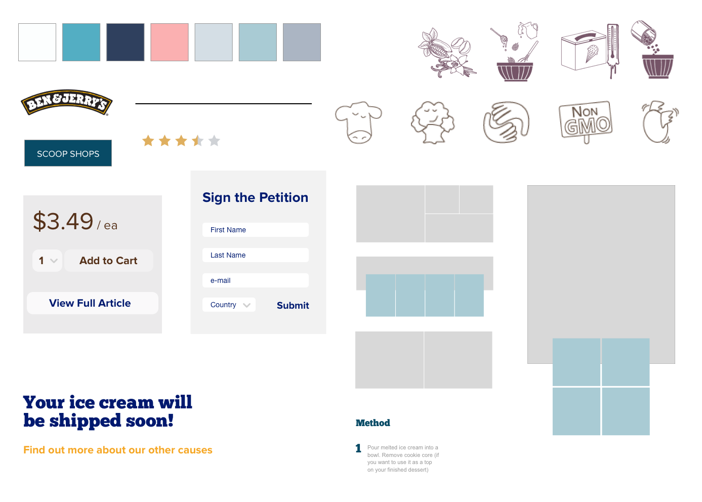
STYLE GUIDE
PROJECT SCREENSHOTS
Main Page:
Article Pages:

Single Product:
Thank You Template:
VALUE PROPOSITION
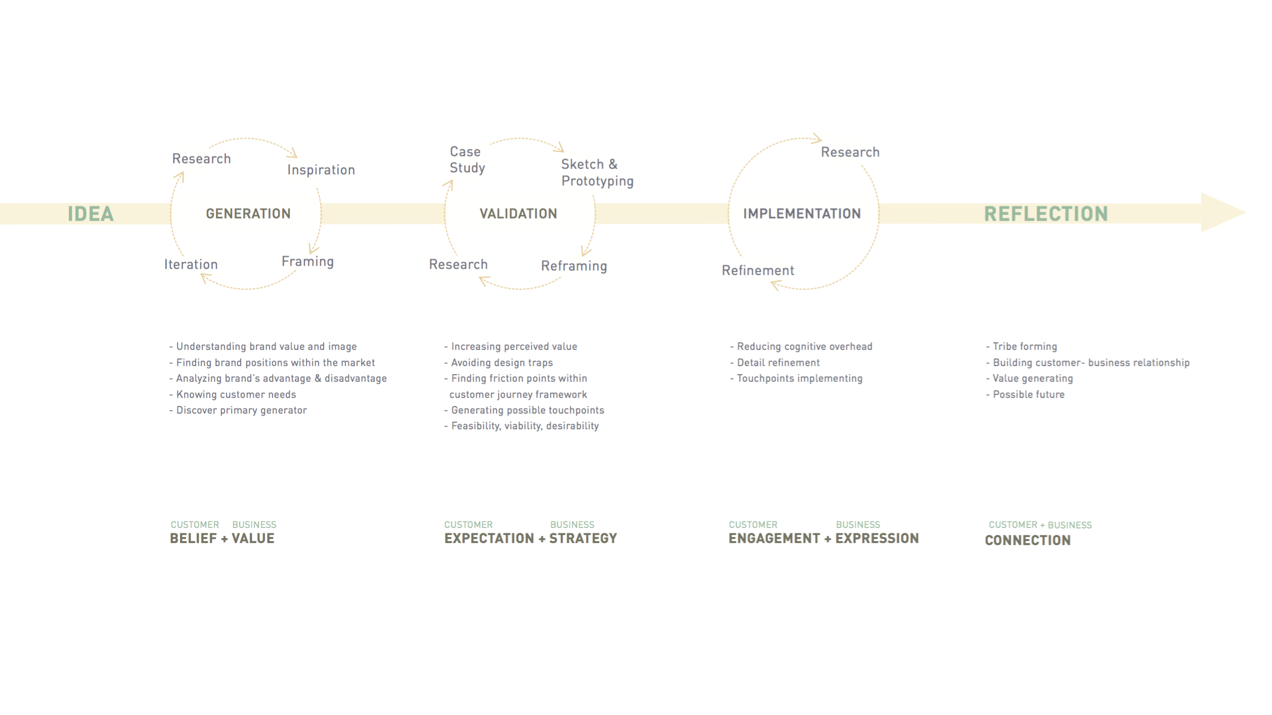
PROCESS FRAMEWORK
