OUTCOME AND ACHIEVEMENTS
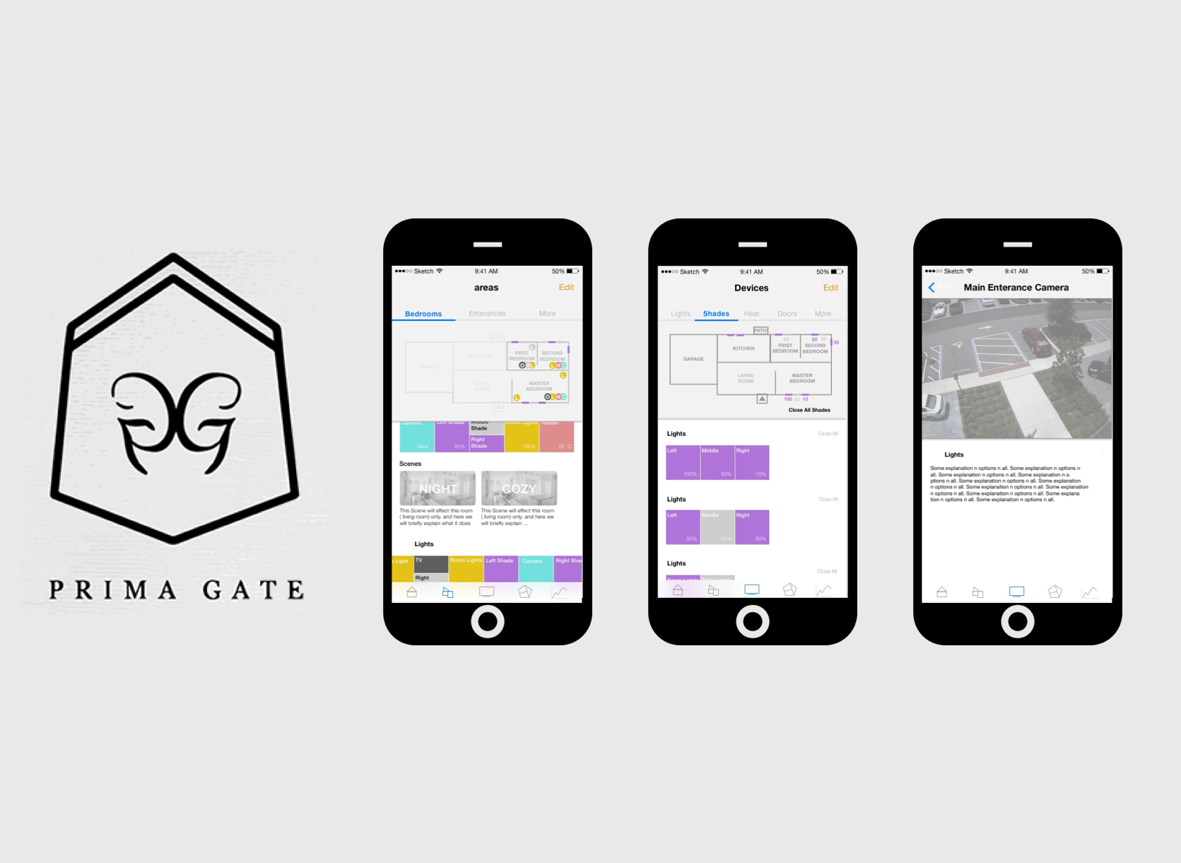
VIEW CASE STUDY
INTERACTIVE PROTOTYPE
Own Startup Company -- Design and Development of iOS Application
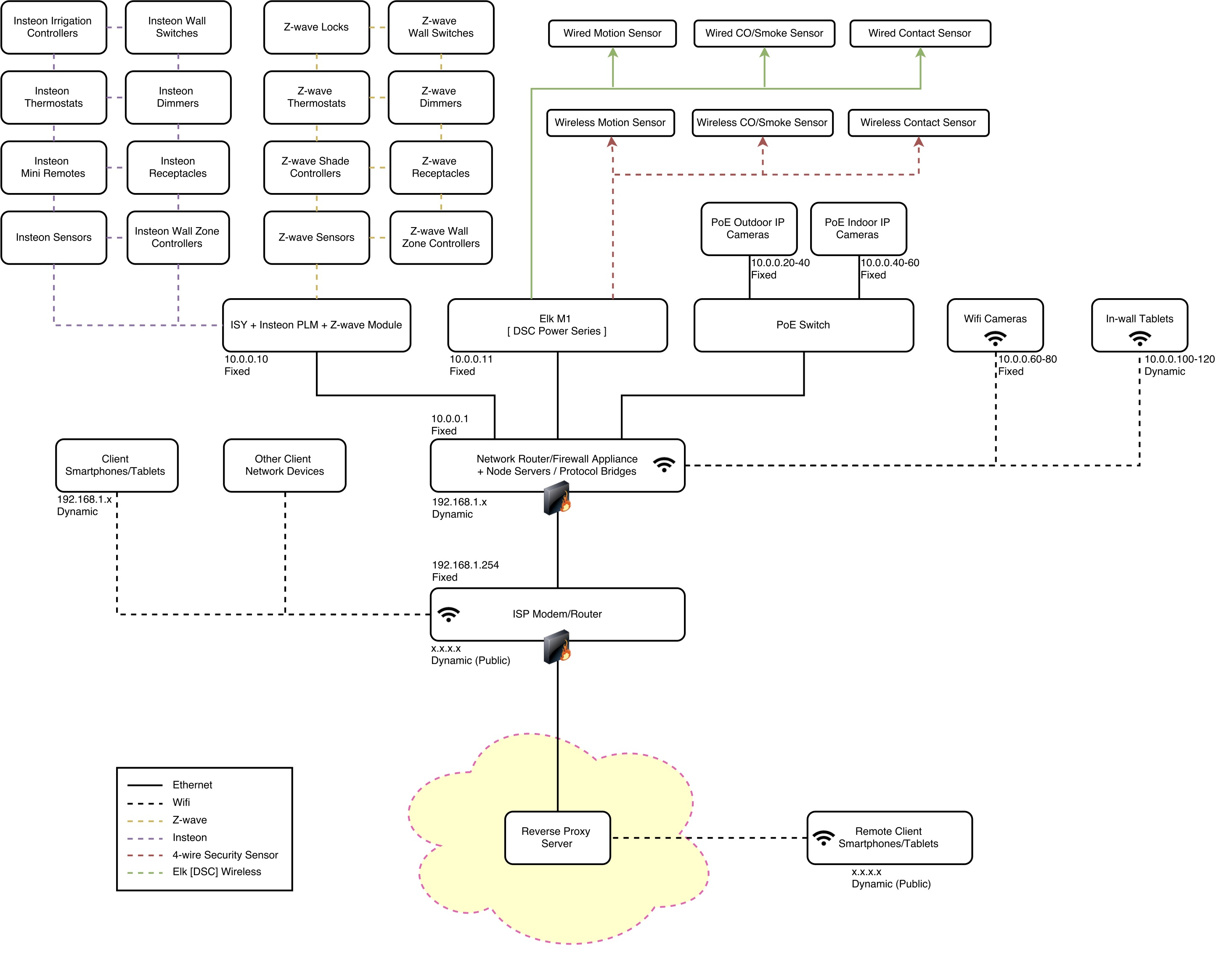
Worked with the back-end developer and hardware engineer to create and maintain a design guideline library, and connection protocols library.
Created and analyzed user surveys and user research data to iterate and redesign UI structures. Maintained and followed a detailed schedule for the design, development and user testing of the project.
Used HTML, CSS and Framework7 to create the user interface of the application. Used AngularJS, JavaScript, PHP, MySQL and REST APIs to communicate user inputs and interactions
with the servers.
Presented weekly high fidelity wireframes and interactive prototypes to communicate ideas and design with the team.
NOTE
**UPDATE: This project was created JAN-DEC 2015, before the release of Apple's Home application and 3D Touch iOS Feature**
ABOUT PRIMAGATE

Mission Statement
Current smart-home systems are prohibitively expensive and the user experience often is not up to twenty-first century standards. PrimaGate is set to make the smart-home experience affordable and intuitive for all.
Members
Arman Samimi ( Hardware Engineer ), Alireza Dibaeinia ( Software Engineer ), Nika Lohrasbi Azar ( UX Designer and Mobile Application Developer )
Key Project Components
The project consisted of three parts: the hardware design and connections, the back-end server development, and the mobile application for controlling the devices installed in home.
Role Overview
Designing and developing a web-based iOS application to remotely control heating, lighting, security, and other devices of the home.
INITIAL BRIEF
Create a mobile application for the system using JavaScript and visual design based on an existing software:
CommandFusion
SUGGESTED REFINEMENT
Based on detailed research and testing, I created a presentation suggesting the team we change the approach of creating the mobile application. After discussions and evaluating my skills the team agreed to change the approach and use a web-based application instead. This way we had more design and creative freedom, while still being able to create quick prototypes and launch the application on both Android and iOS platforms if necessary.
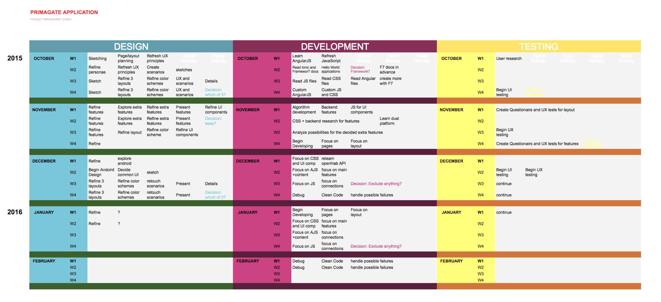
SCHEDULE
The amount of work load was overwhelming for us since we each had many tasks and responsibilities and we were studying full time as well. The industry, programming languages, approaches and real-life hardware testing was also very new to me, therefore there was many new skills that I needed to learn on my own. To break things down for myself and meet important project milestones set by the team, I created a detailed weekly schedule for myself to work on the three aspects of my role: Design, Development, Testing.
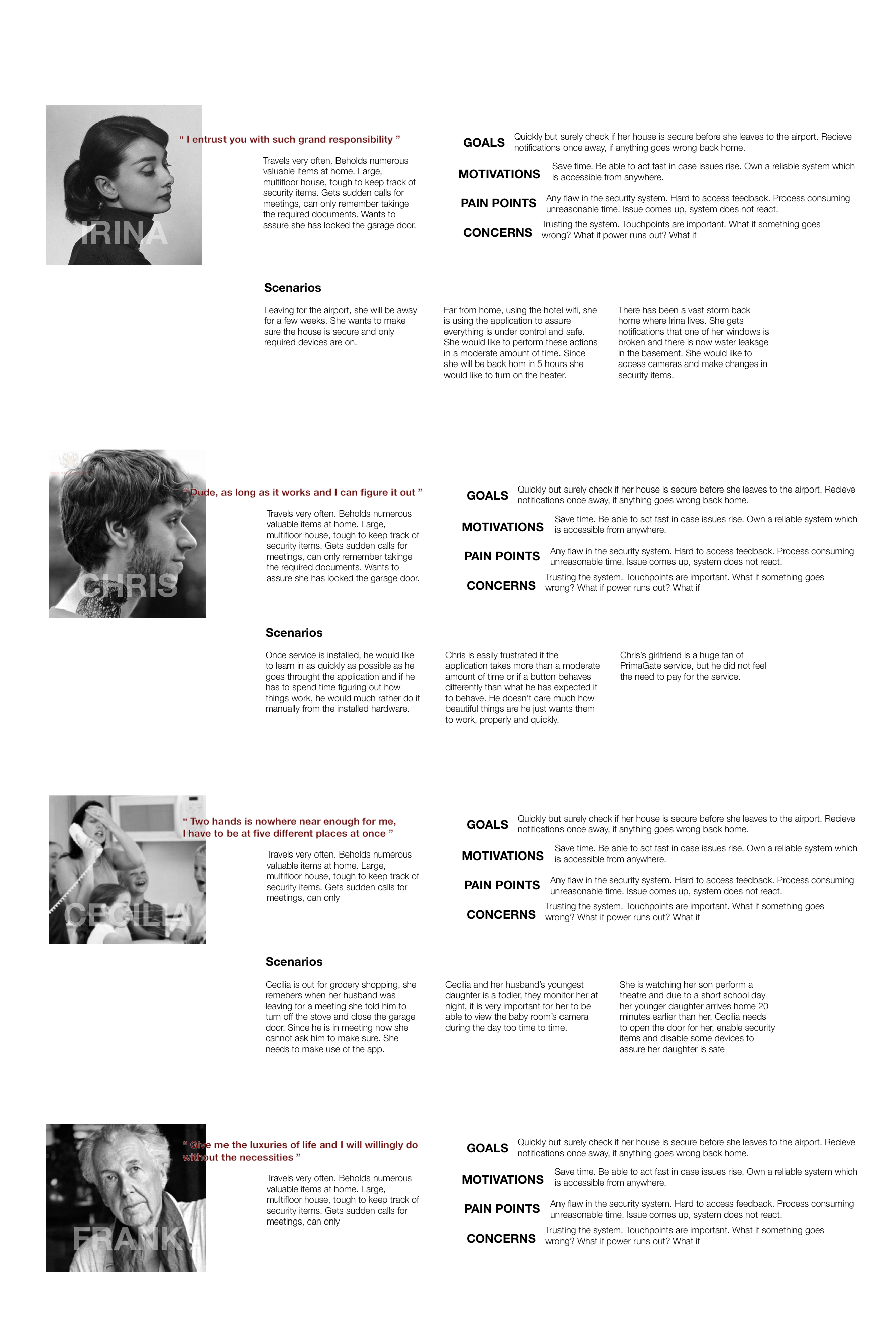
PERSONAS AND SCENARIOS
NETWORK DIAGRAM
iOS RESEARCH
The project was based in Vancouver, and from the research on our target audience, we found out most of our target audience will be using the iOS platform. Once we decided to initially only release the application for iOS, I began researching and understanding iOS design elements and guidelines. I downloaded most iconic iOS applications and made screenshots of every page to analyze them. I also studied the Apple Developer: Human Interface Guidelines. Learning this background information and applying them in my design decisions allowed me to create a simple but intuitive interface.
INFORMATION ARCHITECTURE
There were many devices and each had different input and output formats, and they all seemed to be as important as each other. On the other hand, it was tough for me to understand what each device is and what exactly they do. I decided to study the device documentation given to me and create a visually organized and simplified device breakdown for myself. This helped me visualize the variety and importance of each device and got me started with the information architecture.
The original document was about 100 pages, and for each device it included a recognition code, communication protocols, specific SDK and REST Interface information. Such information was very useful for programming connections for each device but not useful for designing the interface elements.
In the devices breakdown documents that I created, each device was colour coded to specify only what the user needs to know and see. Each device card specifies whether the device is meant for safety or comfort, whether it is meant only for giving user informative feedback or the user may interact with the device, whether the interaction is only on/off or more complex interactions are necessary.

INTERFACE ELEMENTS
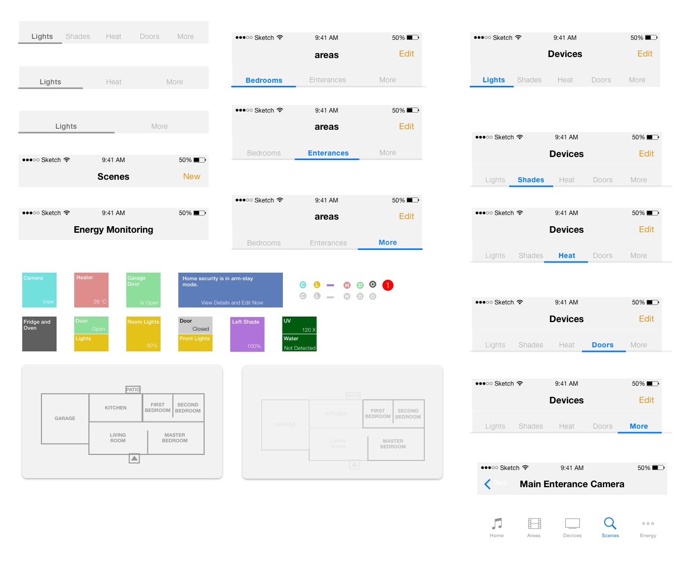
I then continued to put the devices in different categories and groups to find patterns and get a better idea of possible hierarchies. I then printed the cards and used them along with personas and scenarios. This also resulted in some potential visual interface design inspirations and basic user interface elements.


Interface Elements for Prototype One
INITIAL LAYOUTS
Planning and sketching: Working with devices breakdown cards, scenario and personas, I created a potential house map that we would ideally be working with. And tried to imagine how the devices are laid out across the house and how each user might be interacting with the devices at different moments of being at home.
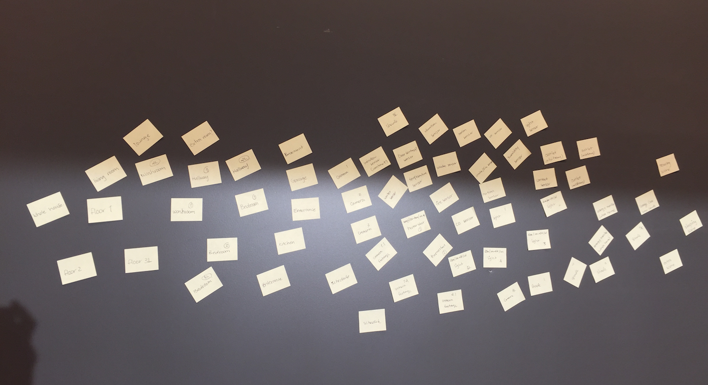
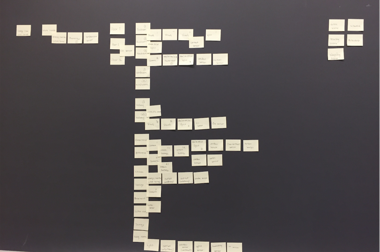
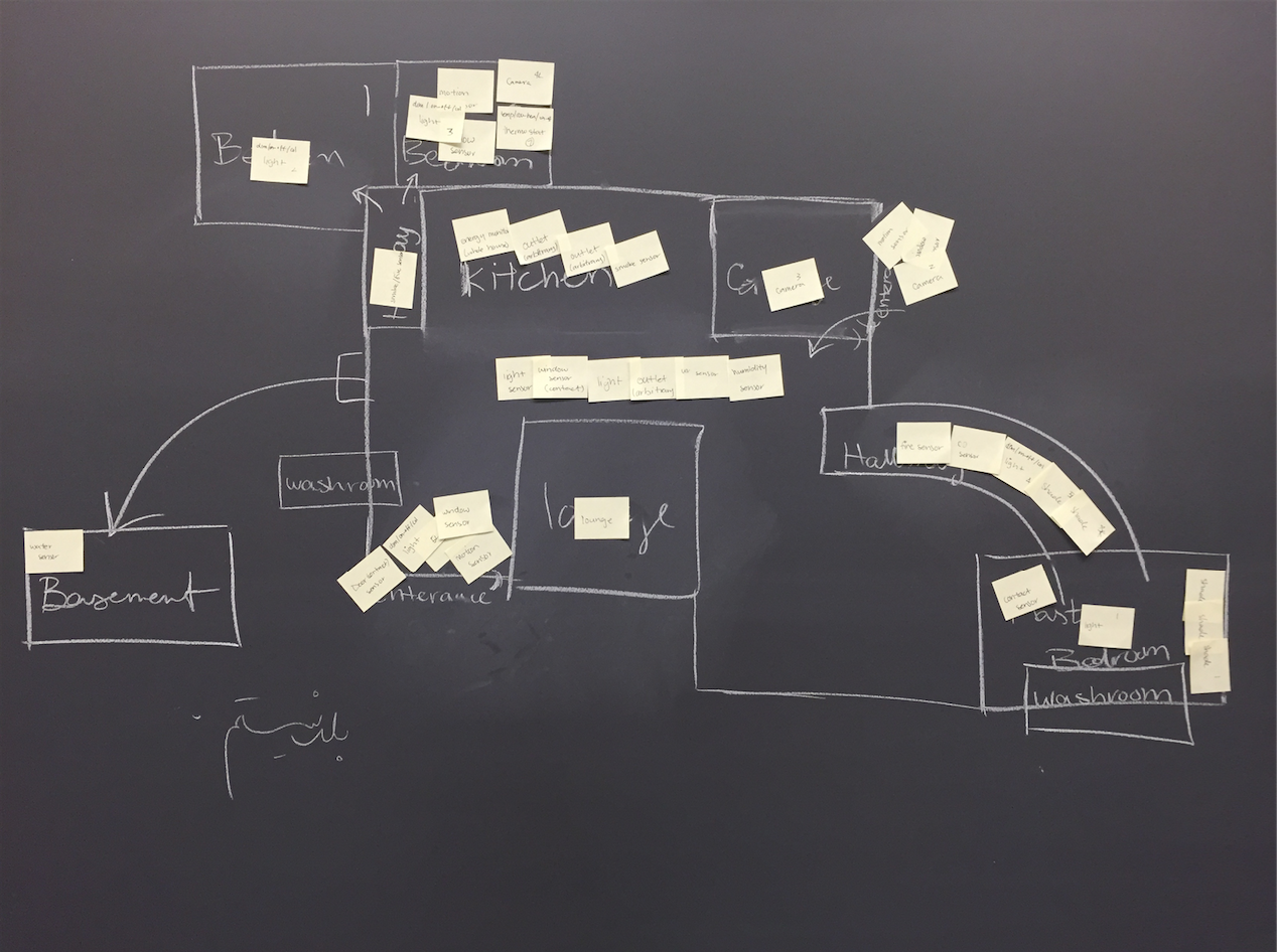
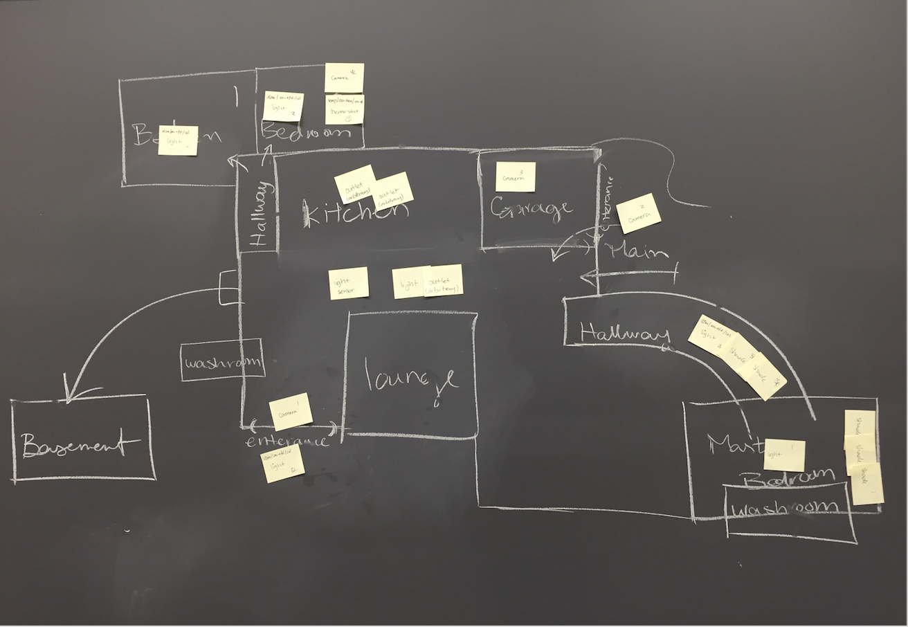
Initial Layouts:
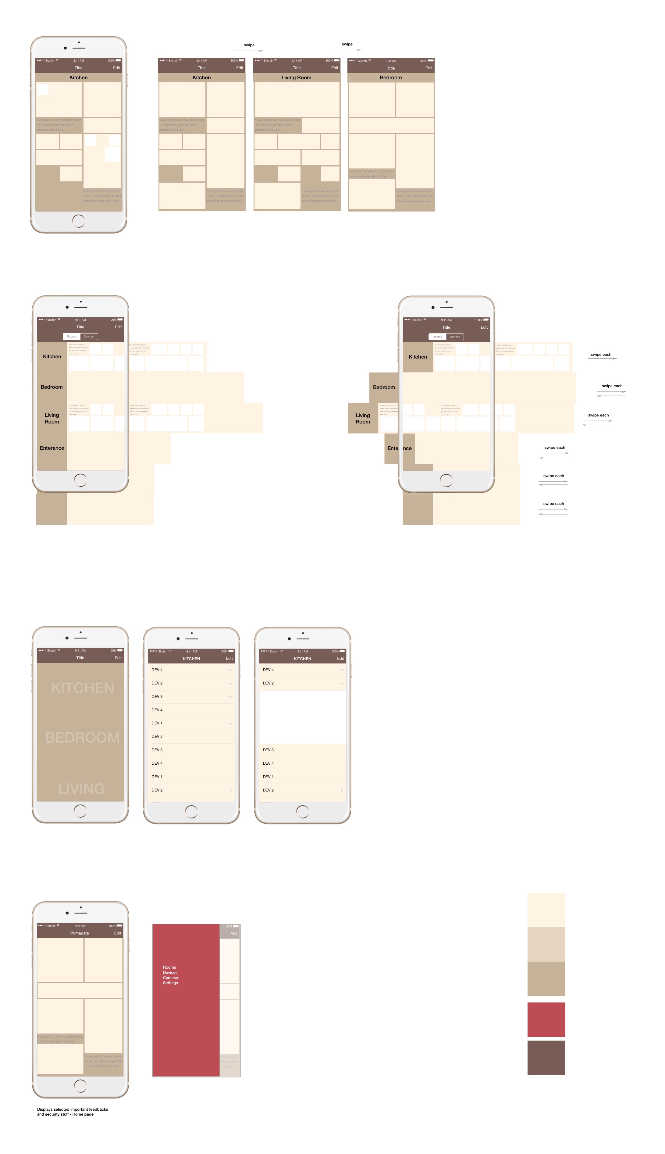
Next Iteration:

FEATURES
Maps
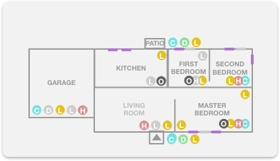
This map was meant to help users locate where the devices are in the house, or easily access all the devices in the room they wish to access. Visually this map took a large space of the application screen so we decided to give the user the option to minimize the map. Developing and creating this map was a bit challenging, and once I proposed the idea, the team liked the feature but asked me to come up with two possible ways we can implement it.
One possible way I could come up with was manually creating the map before instantiating it for the customer, which was feasible for our business model since our company set the devices and the application themselves for the house before the residents purchased or lived in the house. And another tougher but better way I could come up for this feature was automatically creating a rougher map in the instantiating of the application based on the network of the devices. We decided to implement the feature manually to start with, but we did work on the creation of automatic maps as a team.
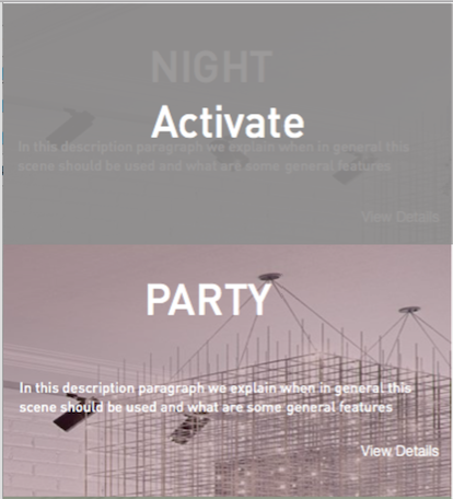
Scenes
Based on the user scenarios and expectations from a smart home, I decided it will be interesting to have pre-set scenes for the house that the user is able to use during repeated moments such as: coming home, leaving for work, etc. I proposed this feature to the team and we looked into the development of it. We realized minimal work is needed only in the front end development of the application to add this feature and therefore we decided to add this feature for our application.
FIRST PROTOTYPE
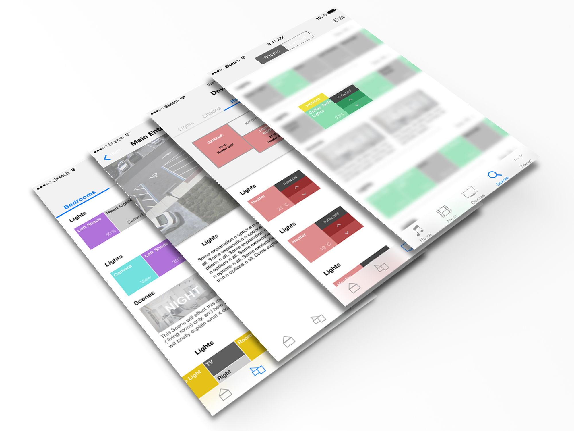
INTERACTIVE PROTOTYPE
Screens:

VISUALS AND INTERACTIONS
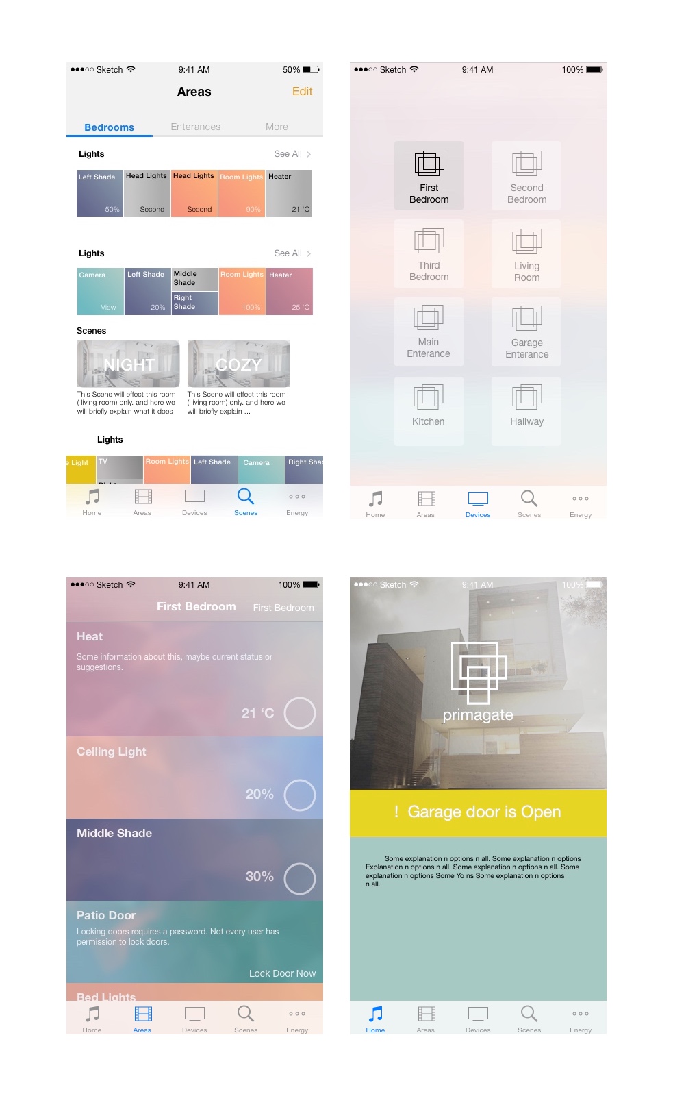
Visual Explorations
Before proceeding forward, I put a quick visual palette and simple prototype using visual components to get feedback from the team, and user testing.
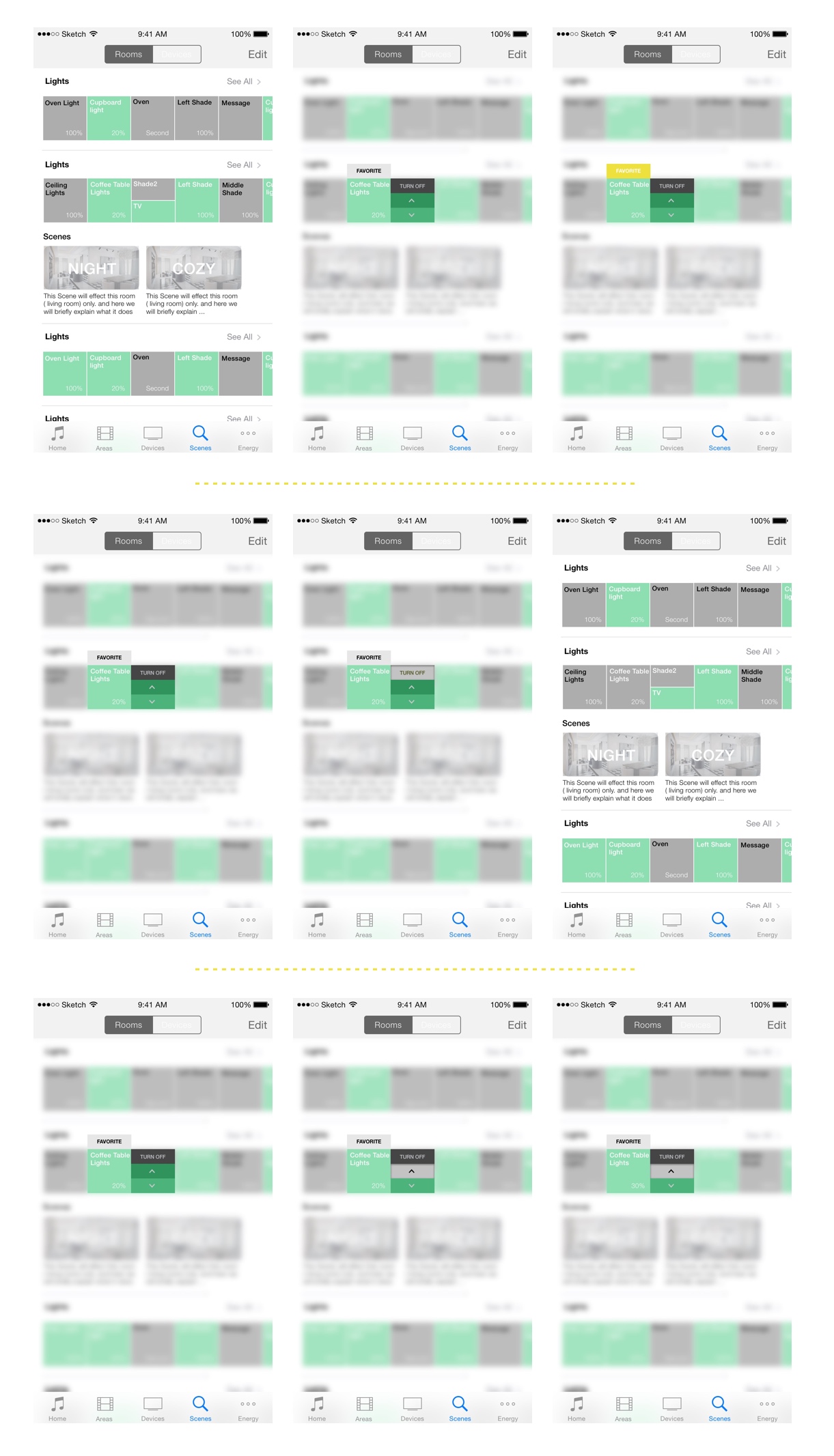
Interaction Exploration
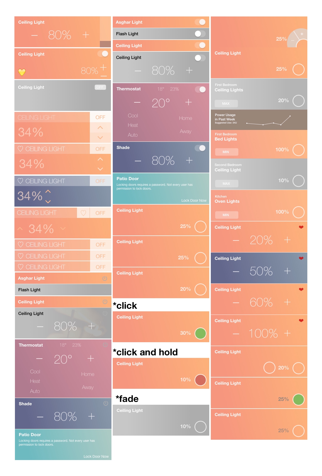
Based on different devices, ui components, hardware limitations and communication protocols. We listed out all the needed interactions and began exploring in what different ways we can represent them to the user. In the meanwhile we also tested a full-width layout design.
More Explorations
DEVELOPMENT
For the development of the application, I began by intently learning JavaScript and AngularJS since it was critical for communicating with the devices through the back-end servers. Afterwards I began learning about different protocols and REST communications since the application controlled ( sent input and received outputs ) the devices through REST API. Afterwards, I began looking into different frameworks such as Ionic and Framework7, and tools such as Node.js, PhoneGap, Cordova and etc. I tried creating the main page of our application to see what the benefits and challenges of each tools is to chose the final ones to work with and propose to the group.
For the development of the application, I began by intently learning JavaScript and AngularJS since it was critical for communicating with the devices through the back-end servers. Afterwards I began looking into different frameworks such as Ionic and Framework7, and tools such as Node.js, PhoneGap, Cordova and etc. I tried creating the main page of our application to see what the benefits and challenges of each tools is to choose the final ones to work with and propose to the group.
PROTOCOLS AND CONNECTIONS
The communication between the devices and the application was through a back-end server, created and designed by another member using mostly REST APIs. Languages used in the application to make this possible were mostly AngularJS and JavaScript, but PHP and MySQL were also necessary for some pages.
CHALLENGES
The communication between the devices and the application was through a back-end server, created and designed by another member using mostly REST APIs. Languages used in the application to make this possible were mostly AngularJS and JavaScript, but PHP and MySQL were also necessary for some pages.